Explore  

How to create better product wireframes (18 expert tips)

Last updated: April 2024

Wireframe mockup prototype. In the early stages of product design, product teams use these tools to show how a new feature or webpage should look — coloring in more detail with each iteration. Because your wireframe comes first, it provides the basic foundation for the rest of the design. That means you want to start off strong.

Most wireframes are low-fidelity renderings. You use basic shapes and colors to communicate high-level concepts (like where to place a menu or what happens after users click a button). The idea is to have an early-stage blueprint for sharing ideas and gathering feedback on a new functionality's layout — before visual details firm up.

Although the result is a simple sketch, wireframing is not always easy. It requires an understanding of the "why" behind what you are depicting and the ability to show this on a screen. Wireframes are most effective when you have:

If you are a UX designer, wireframing is probably a task you feel comfortable doing. But product managers work on wireframes, too. This might be intimidating if you do not have a background in design. But not to worry — we are here to help you feel more confident. In this guide, let's walk through 18 ways to help you plan, create, and share better wireframes during product development.

These tips are grouped into categories, so read on or jump ahead here:

Create intuitive wireframes in Aha! software — free for 30 days.
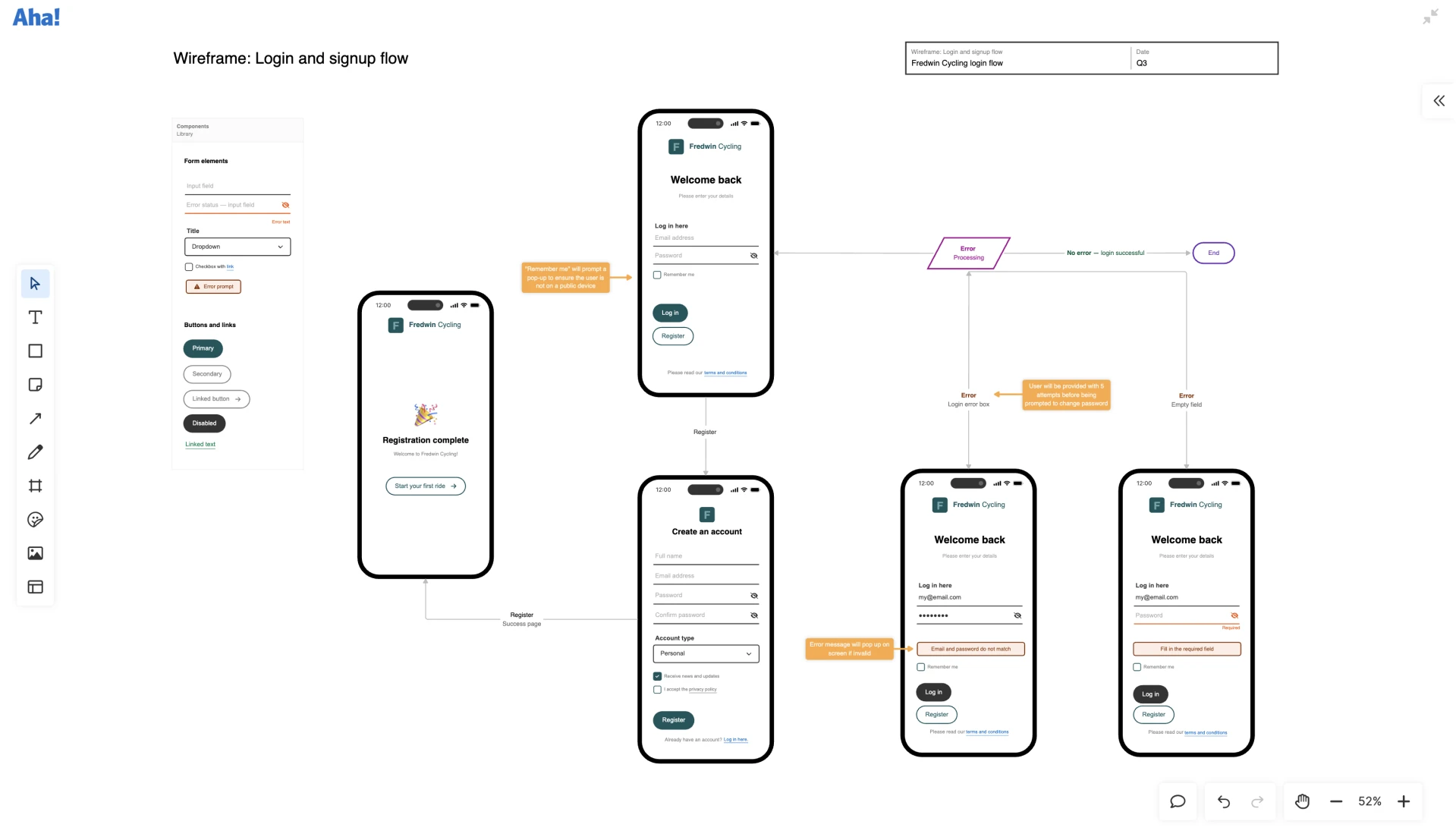
Map out a detailed signup flow for your app on a whiteboard in Aha! software. Get started quickly with the signup wireframe template.

18 expert wireframing tips for product managers

The list below is a collection of tips from our very own Aha! UX team — so you can trust that it is real expert advice. Learning just a few of these pointers can make a difference in your ability to communicate design ideas with the broader product team.

Getting started with wireframes

Before you start envisioning your wireframe, it is essential to get aligned on a few key pieces of information first:

  • Define your objective: Beyond the visual elements, think about what you want your wireframe to communicate. What is the purpose of designing the feature or webpage this way? What do you want your users to achieve? Be sure to document your answers.

  • Define the user objective: Consider what your users want to accomplish when using this functionality. If you are not sure, try mapping out the user journey to get a better understanding of their intent.

  • Use goals as a guide: Keep both of these objectives in mind as you start wireframing. This will steer you toward creating a wireframe that supports both business and user needs.

Choosing a wireframe tool

A high-quality tool can save you time and frustration throughout the wireframing process. That does not mean it has to be sophisticated — in fact, it is better to select a wireframe tool that is somewhat user-friendly (so you can work efficiently without a steep design learning curve).

  • Explore your options: You could create a wireframe in PowerPoint or another generic tool. But if you plan to build wireframes regularly, it is worth considering a tool equipped for the job — whether that is a dedicated wireframe tool or whiteboarding software with wireframing capabilities.

  • Consider the components: Think about the types of wireframes you need to design. Will they be primarily for product features? Or website wireframes? Either way, ensure the tool you choose has the necessary built-in wireframe components — such as device frames, controls, and navigation.

  • Check your tech stack: Adding another tool to the mix might be met with hesitation. It helps if you can choose one that integrates into your existing workflows. For example, you can embed whiteboards right into your feature requirements in Aha! software. This makes product planning more seamless.

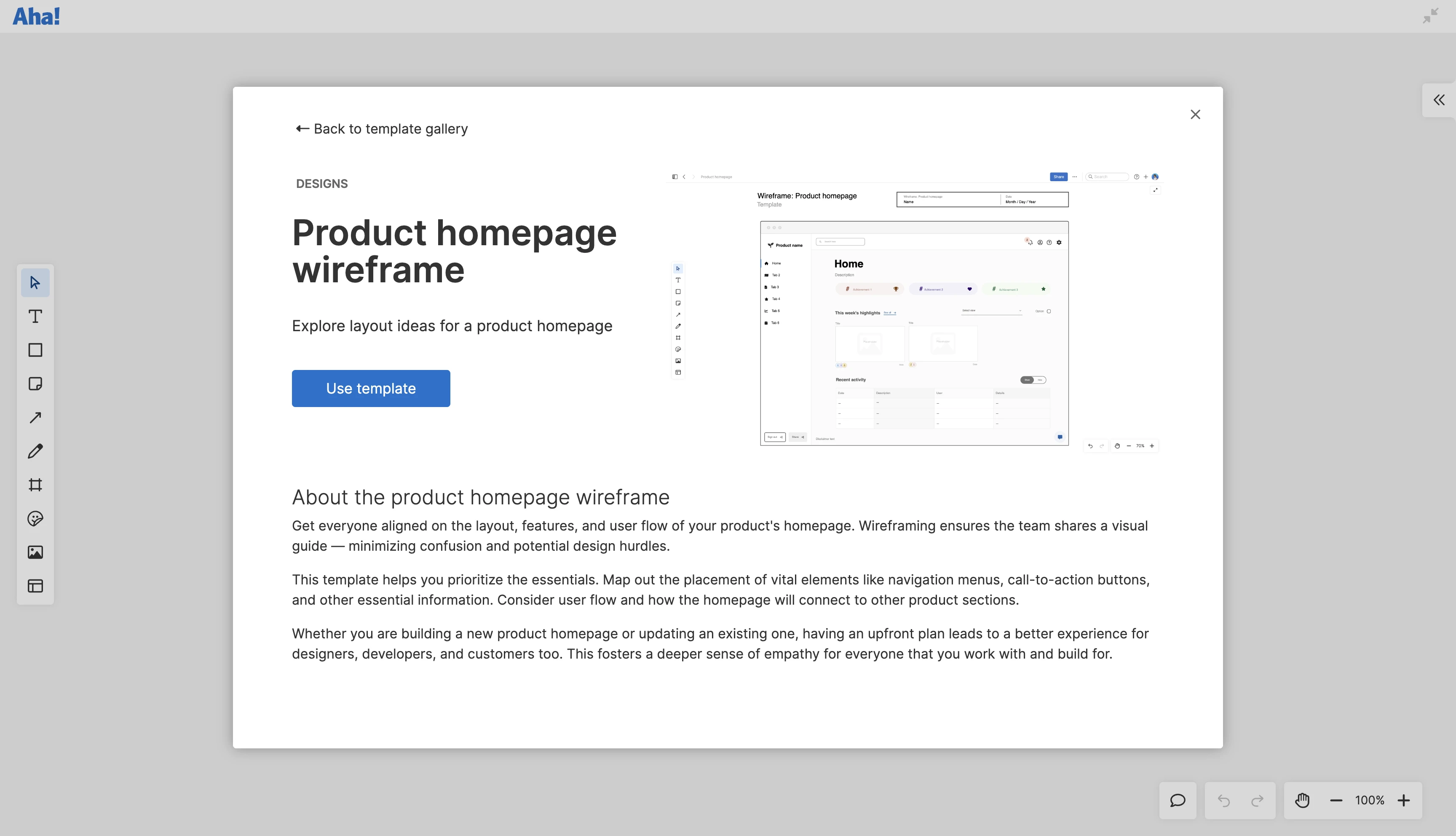
A description of the product homepage wireframe template on a whiteboard in Aha! software

Some wireframe tools come equipped with templates for different use cases. Try the product homepage wireframe template in Aha! software.

Related:

Creating your wireframe

You have a plan, and you have a tool — now, let's get into creating the wireframe itself. Whether you start from a blank canvas or a wireframe template, these tips can help you feel confident in your design:

  • Frame your design: Start with a simple frame to represent a screen, or use a device frame. For example, if you are creating a wireframe for a desktop app, choose a laptop-style device frame. This keeps you mindful of a layout's constraints.

  • Map out your screens: Create frames for all necessary pages or screens. For example, in wireframe for a login process, you would create multiple frames for different results — like login error or success. These placeholders help you to visualize the user flow as a whole before filling in any details.

  • Sketch basic layouts: Use simple shapes to outline the major sections of each page (for example, narrow rectangles for headers and larger squares for body content). This helps designate what goes where early on.

  • Focus on user input: With a skeleton framework in place, add some key details — starting with user engagement. This includes interactive elements like buttons, hyperlinks, hover states, and more. Begin with the first frame and then continue on with the rest.

  • Add some flair: A splash of branding and design can help the wireframe feel more realistic. Focus on the first page until things look polished — adding colors or images, refining sizes, and selecting typography.

  • Replicate and adapt: After refining the first screen on your wireframe, identify design elements that will recur on other pages. For example, if a login form appears on both the success and error screens, copy how the element is styled on the first page, paste it on the next one, and adjust the context as necessary. This ensures consistency across the entire wireframe.

  • Establish connections: Use connector shapes to depict how users flow through the various frames and elements on your wireframe. You can also add annotations or other indicators.

  • Review and finalize: Once you build out the structure, design elements, and flow, review your entire wireframe and make final touches. Are design elements consistent? Is the navigation clear? Does the content provide enough detail for viewers at this stage? Most importantly, check that your finished wireframe meets the objectives you set at the start.

Editor's note: Although the visual below still shows core functionality within Aha! software, some of the interface might be out of date. View our knowledge base for the most updated insights into Aha! software.

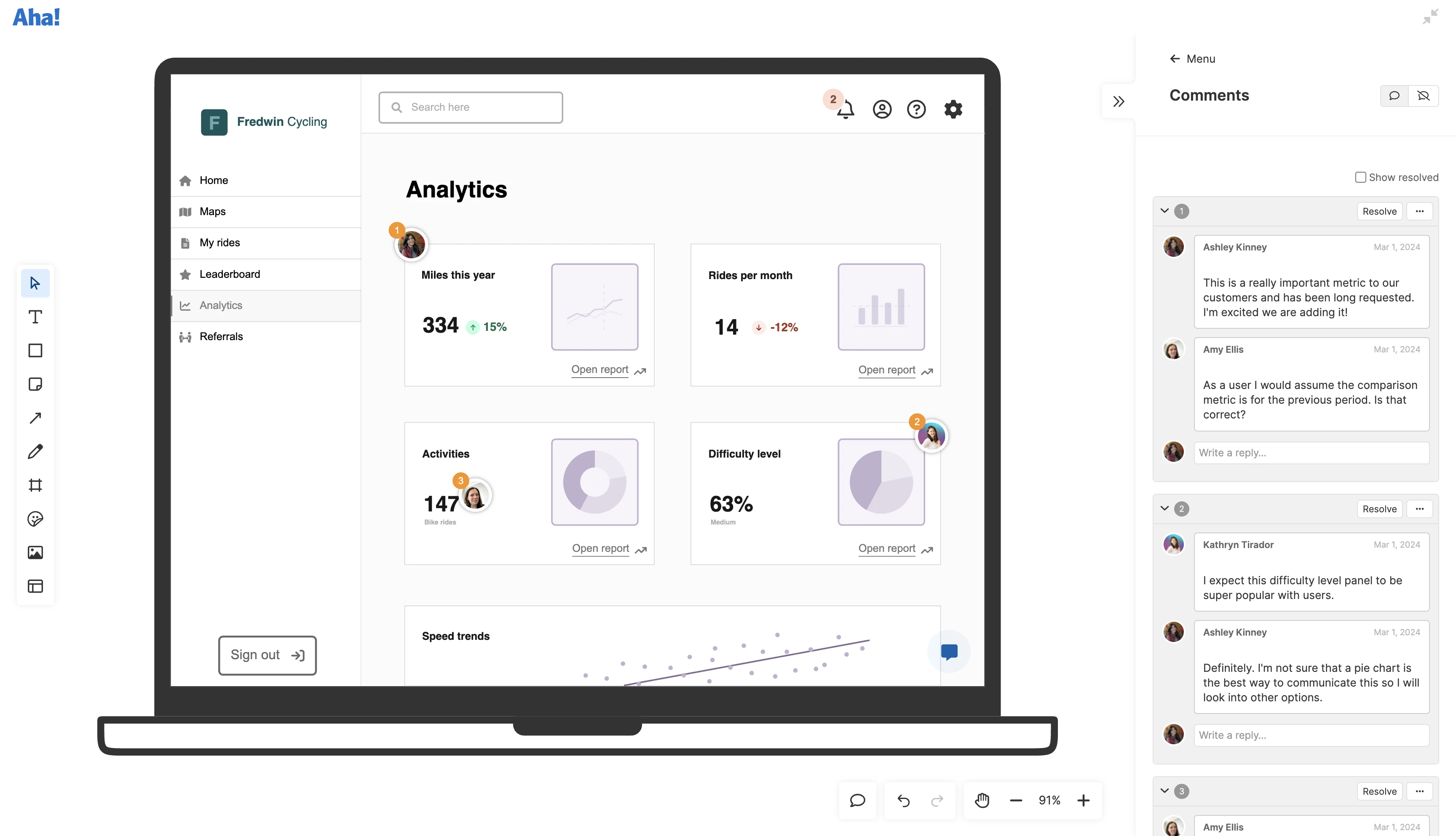
An analytics dashboard wireframe in Aha! software with the comment section open

With a whiteboard in Aha! software, you can easily gather team feedback on your wireframe with inline comments.

Here is one last tip. When you are ready to try out these tips on your own, check out whiteboard-based wireframes in Aha! software. Ours is the only purpose-built whiteboarding software for product teams — which means it was created with product management and UX needs in mind. You can create high-quality wireframes fast, gather feedback on your whiteboard, and even embed wireframes in product features or other records. Try it for yourself to see all of this in action.

FAQs about wireframes

What is a wireframe for a website?

A website wireframe outlines the basic structure and layout of a webpage, focusing on content placement. It typically lacks design elements like colors and images and uses placeholder copy. It is different from a product wireframe, which displays various screens and user interactions with a software or app interface.

How does a wireframe relate to a storyboard?

Wireframes and storyboards can both be used to portray how users interact with a product. Whereas a wireframe provides a basic layout of a product's interface and how it is intended to function, a storyboard offers a narrative depiction of the user's journey through the product.

When should wireframing be done in the product development process?

Wireframing should ideally happen early in your product planning. This helps establish the basic structure, layout, and functionality of a product feature or enhancement upfront. That way, product teams can iterate and refine ideas, gather feedback, and ensure alignment with user needs and business goals — before moving forward with detailed design and development work.

Are wireframes a one-time deliverable, or are they subject to change?

A wireframe is not a one-time deliverable — it acts as a vehicle for communication and feedback. It gives the UX team and other stakeholders something to react to and offer input on as the product feature takes shape. This means that wireframes might need to be revised to incorporate new insights or changes in direction before they can evolve into mockups and prototypes.