What is the difference between a wireframe, mockup, and prototype?
Last updated: April 2026
What is a wireframe vs. a mockup vs. a prototype? They are all tools that product teams use to design and build what customers want — but in slightly different ways. A wireframe is a simple rendering of a new product or feature's structure and function. A mockup adds visual detail, displaying how final designs will look. Prototypes allow viewers to dynamically interact with designs before development begins.
Wireframes, mockups, and prototypes all serve a unique role at distinct times during the product development lifecycle. You can use each one to illustrate concepts, gather feedback, and gain consensus so the team can design and build exactly what customers want. And today, you can even create all of these things fairly quickly with help from AI.
Create a wireframe, mockup, or prototype in Aha! software — get started.
These terms are often used interchangeably, which may introduce confusion about when and how you should leverage each one during your product development process. Choosing the right one at the right stage ensures that the correct level of effort is invested so that you can deliver functionality that solves a real customer need.
Jump ahead to quickly find the information you need:
How do wireframes, mockups, and prototypes compare to each other?
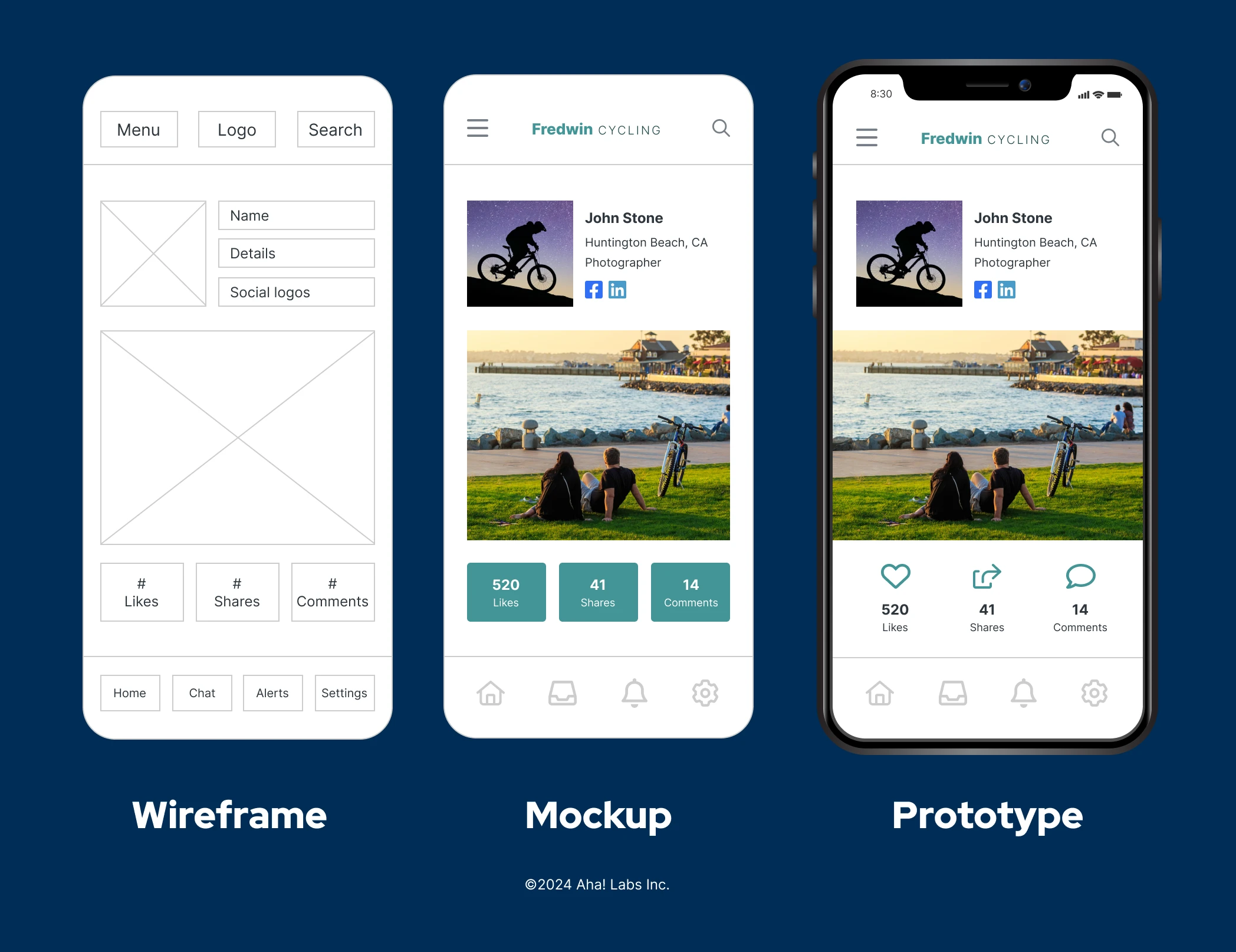
One way to quickly understand the difference between wireframes, mockups, and prototypes is to compare them visually. A wireframe is typically low-fidelity — a basic sketch with simple boxes and text to convey a concept. A mockup is static but may have added logos, colors, and icons to make it more realistic. And finally, a prototype is a high-fidelity representation that is interactive and demonstrates how a user will engage with the new product or feature.
You will not necessarily need to create all three for every product or feature you work on. Depending on the level of feedback and visibility needed, a wireframe or mockup alone can get you the necessary buy-in. The table below compares the differences between wireframes, mockups, and prototypes in greater detail:
Wireframe | Mockup | Prototype | |
What | A quick sketch to convey the high-level concept of new product functionality | A realistic visual design that resembles what the new product functionality will look like | Interactive simulation of new product functionality |
Purpose | To gain consensus and collect internal feedback on how new functionality will work | To facilitate more detailed critiques of visual elements and functionality so changes can be made | To collect feedback by user testing the real experience |
Design fidelity | Low | Middle | High |
Included elements | The format and structure of content | Additional visual elements like logos, colors, and icons | Final interactive elements and navigation |
Time invested | Low | Medium | High |
Creator | PM or UX designer | UX designer | UX designer |
Wireframe
Wireframes are the foundation of the design that everything else is built upon. They are black and white depictions that rely heavily on grey boxes and text to represent what a product will look like. They are low fidelity and quick to create and are often used in brainstorming sessions. Creation can be done using paper and pencil, a whiteboard, or in a product management tool — and does not necessarily need to be done by a UX designer. Product managers may jump in to help ideate. Wireframes should be used to reach consensus on the core functionality of a concept. The absence of visual elements like colors and logos is intentional as critiques should be focused on whether or not the proposed layout or arrangement would help users, not visual details.
Mockup
Mockups elevate wireframes to the next level by adding design choices such as color schemes, fonts, icons, and navigation elements. More than one mockup is usually created, providing decision-makers with multiple options to evaluate. Actual content is often included to make the renderings more representative of the final product. More effort is required to create mockups and more skill as well. A UX designer will use digital software to create and present the options.
When the mockups are presented to stakeholders, a more detailed visual critique is encouraged. The realistic portrayals make it simple to assess what makes sense about the designs from the users perspective. Comparing mockups helps the team agree on a design direction. The static nature of mockups allows for easy incorporation of any changes or requests.
Prototype
Prototypes are developed when usability testing and user feedback sessions are needed. The prototype will look very similar to a mockup, but with interactive elements included. Traditional UX tools can do this without code. As such, the prototype will not be fully functional, but elements will be interactive enough for core concepts to be validated. On the other hand, newer prototyping tools can create more sophisticated prototypes with code that are backed by real data.
Once developed, prototypes are invaluable tools in user testing. The ability to see how a real user interacts with the product or feature provides insights for the entire product team. After testing rounds are complete and applicable feedback is incorporated, the prototype moves over to the development team for execution.
Wireframes, mockups, and prototypes bring clarity to what customers really need so teams can build a product users love. Many product teams choose purpose-built product management software to centralize product strategy and build and share visual product roadmaps. The Aha! software suite includes wireframing, mockup, and prototyping capabilities as well as file-storage integrations so teams can easily access the latest designs alongside their product plans.
FAQs about wireframes, mockups, and prototypes
A wireframe is a rough, high-level sketch that outlines new product functionality. A mockup builds on this by providing a more realistic design to show how it might look for users. A prototype adds even more detail, creating an interactive simulation that users can test out and provide feedback on. We cover the differences in more detail in this section above.
Aha! software offers several wireframe templates to help you get started:
Analytics dashboard wireframe template: Ideal for data, reporting, or performance dashboards
Product homepage wireframe template: Explore different homepage experience options
Signup wireframe template: Define your product's signup or login flows
Sign up for an Aha! Whiteboards trial to use these templates free for 30 days. Need a more full-fledged product management solution? Elements in Aha! Whiteboards can link to work items in Aha! Roadmaps to create detailed plans.
Popular tools for wireframing and mockups include Figma, Balsamiq, Adobe XD, and Sketch. Of course, we would be remiss not to also mention Aha! Whiteboards for all your wireframing and mockup needs.
As for prototyping, Figma is also a player here — as are Lovable, Axure RP, and ProtoPie. You can also use Aha! Builder to build robust prototypes with Elle, the AI assistant in Aha! software.
One of the key advantages to Aha! Whiteboards and Aha! Builder is that they are part of a comprehensive product management suite. Unlike standalone design tools, Aha! Whiteboards and Aha! Builder let you create wireframes, mockups, and prototypes while keeping them connected to your product plans — ensuring ease of use and cross-team alignment.
Curious to see it in action? Start your free trial of Aha! Whiteboards here, or give Aha! Builder a try for more in-depth prototyping needs.


