Explore  

How to show data on a visual product roadmap

Last updated: May 2024

How do you inform and inspire people when it comes to your product plans? A compelling roadmap visualization is one of the most effective ways — it helps you communicate the priority, timing, and progress of your upcoming work. And because our brains process images faster than words, visual roadmap cues can create "stickiness" in your audience members' minds.

Go from spreadsheets to a beautiful roadmap. Try Aha! Roadmaps.

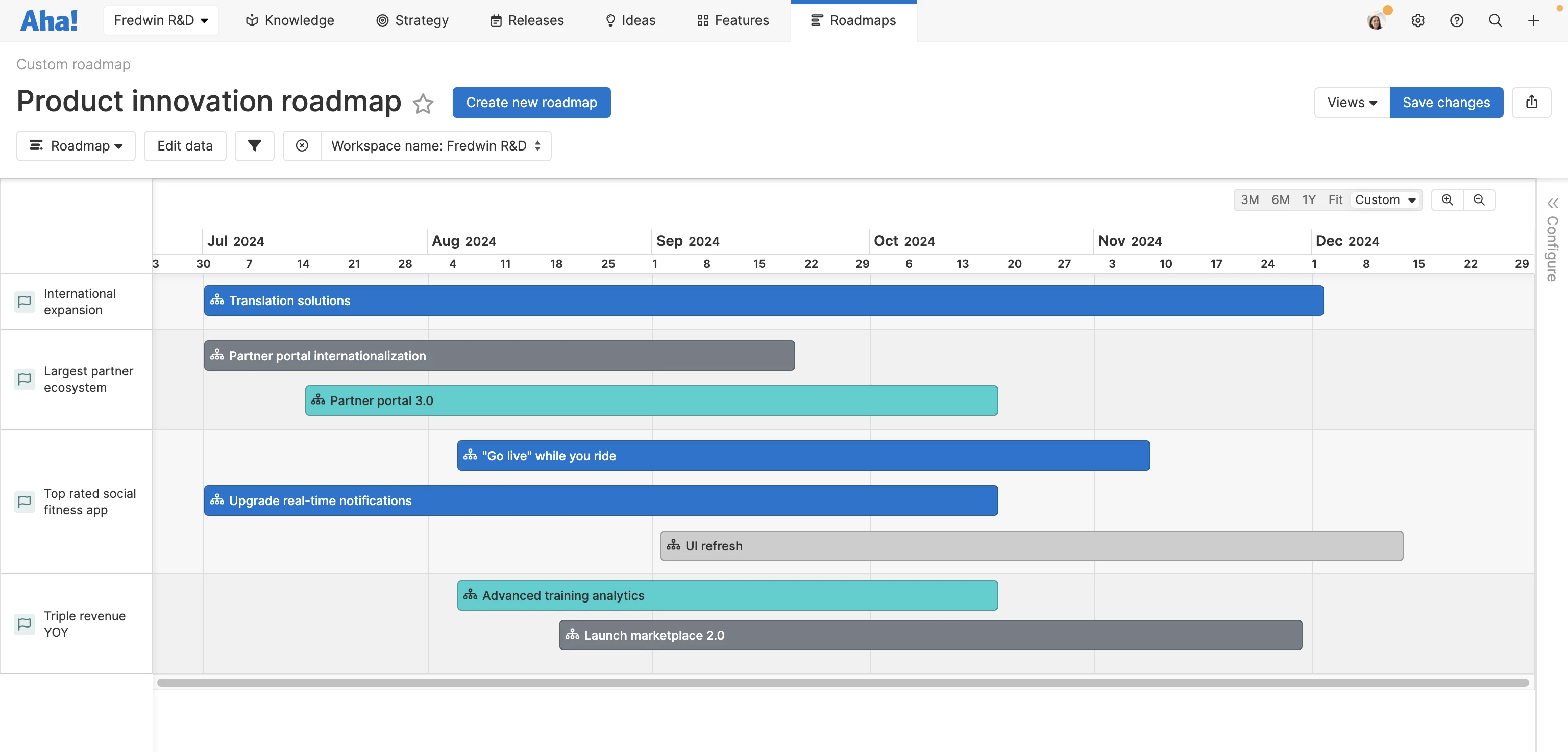
An example of a custom roadmap in Aha! software that showcases a team's product innovation plans

Create eye-catching color-coded roadmaps using real product data in Aha! Roadmaps.

Your product roadmap is the outcome of deep thinking and strategic prioritization. So you want to be mindful about how you present this information — you need to know who you are presenting to and what insights matter most to them. You also need to visualize data clearly to help people quickly get the information they need.

With some thoughtful customization, you can build a visual product roadmap that will engage and impress any onlookers. And we are here to help you get started. Read on or skip ahead here:

Planning your visual product roadmap

Before you get into the details of your product roadmap, you have a few preliminary things to consider. This will help you create the best visual for what you need. It is important to:

  1. Know your audience: There are many potential audiences for your roadmap. The roadmap data you show will depend on this. For example, leadership will want to see high-level strategy and progress toward product goals and initiatives. Your engineering team will be more focused on upcoming releases and feature priorities. Knowing who will view your roadmap and what they care about is going to help you shape the best view.

  2. Choose a roadmap type: With your audience in mind, consider how you want to group and display key information on a high level. Pick a type of product roadmap to start with the right framework. For instance, choose a strategy roadmap if you want to highlight key initiatives and the planned features that will support it. For a more detailed view, select a features roadmap to share the specifics of upcoming functionality.

  3. Keep it updated: Product plans are dynamic. As things change, you will want to adjust your roadmap to keep it in sync with reality. This helps team members stay aligned with work and ensures stakeholders are in the know on any changes. You can set reminders to get in the habit of regular updates — but an easier way to keep your roadmaps fresh is by using a dynamic roadmapping tool such as Aha! Roadmaps. That way, your roadmap will reflect changes automatically.

Related:

Top

Showing data on your roadmap

Once you have the right context for your roadmap, it is time to customize it. Let's go over some ways you can use beautiful roadmap visualizations to bring your product data to life.
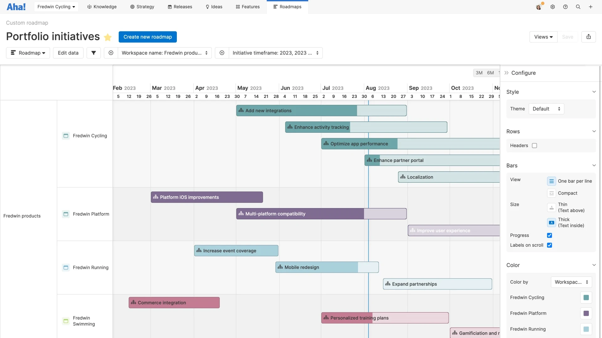
A custom roadmaps created in Aha! software to showcase progress on initiatives across a company's product portfolio

Show progress data and color-code work on your product roadmap with Aha! Roadmaps.

Time frame

Dates matter. Choose a time frame (e.g., three months, six months, or a year) so you can zoom in or out on what is most important to highlight. This will vary depending on your audience. For example: On your product team's roadmap, you could get granular with exact delivery dates each month. And on a customer-facing roadmap, you could zoom out to the quarterly level — or not show dates at all and simply opt for a Now, Next, Later format.

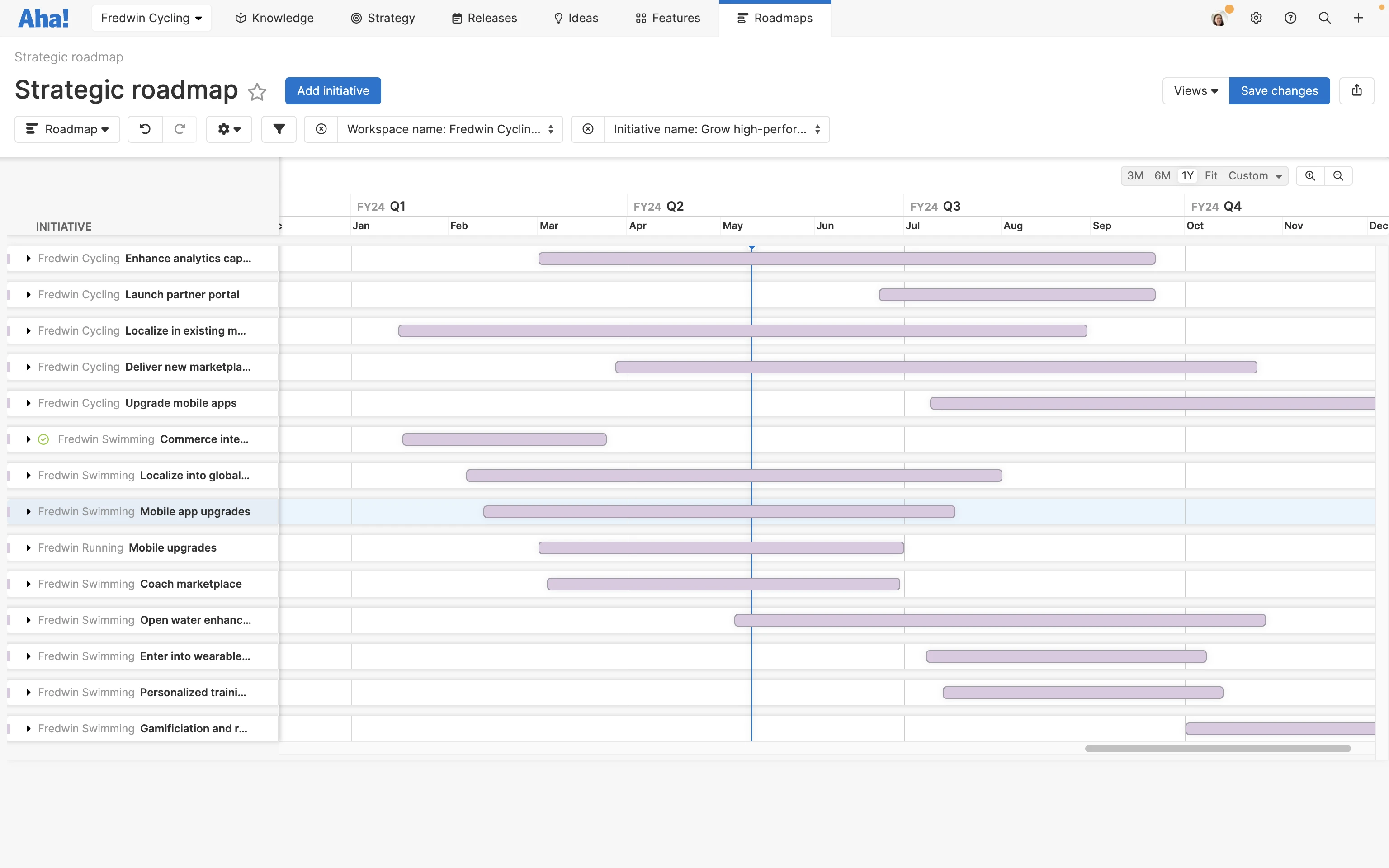
A sample strategic roadmap in Aha! software

In the roadmap example above, we chose a one-year timeline that displays show work by month.

Swimlanes and sorting

Logically, most roadmaps follow a horizontal timeline. But the vertical structure will correspond to the roadmap type. Based on the type you choose, your roadmap might show data for multiple initiatives, products, or releases organized into swimlanes. These are stacked on top of one another in a view.

You can list swimlanes chronologically by start or end date. But you can also choose to organize by priority level or alphabetical order. It all depends on what you want to communicate. For instance, if you build a portfolio roadmap to show releases across multiple products, you might want to sort by launch dates — so it is clear what is coming next. But if you create a roadmap for a single product, you might show the highest-priority features at the top of your roadmap (even if other work will be completed faster).


In the roadmap example above, our swimlanes represent different products within a portfolio. We kept it simple — products are sorted vertically in alphabetical order with corresponding initiatives visible for each of them.

Colors

One of the easiest ways to lend visual interest? Add color. Color also provides visual separation and differentiation. You might assign specific colors to different products, teams, or owners. Status can be communicated using color too. For an at-a-glance view, apply green to on-track items and red to those at risk.

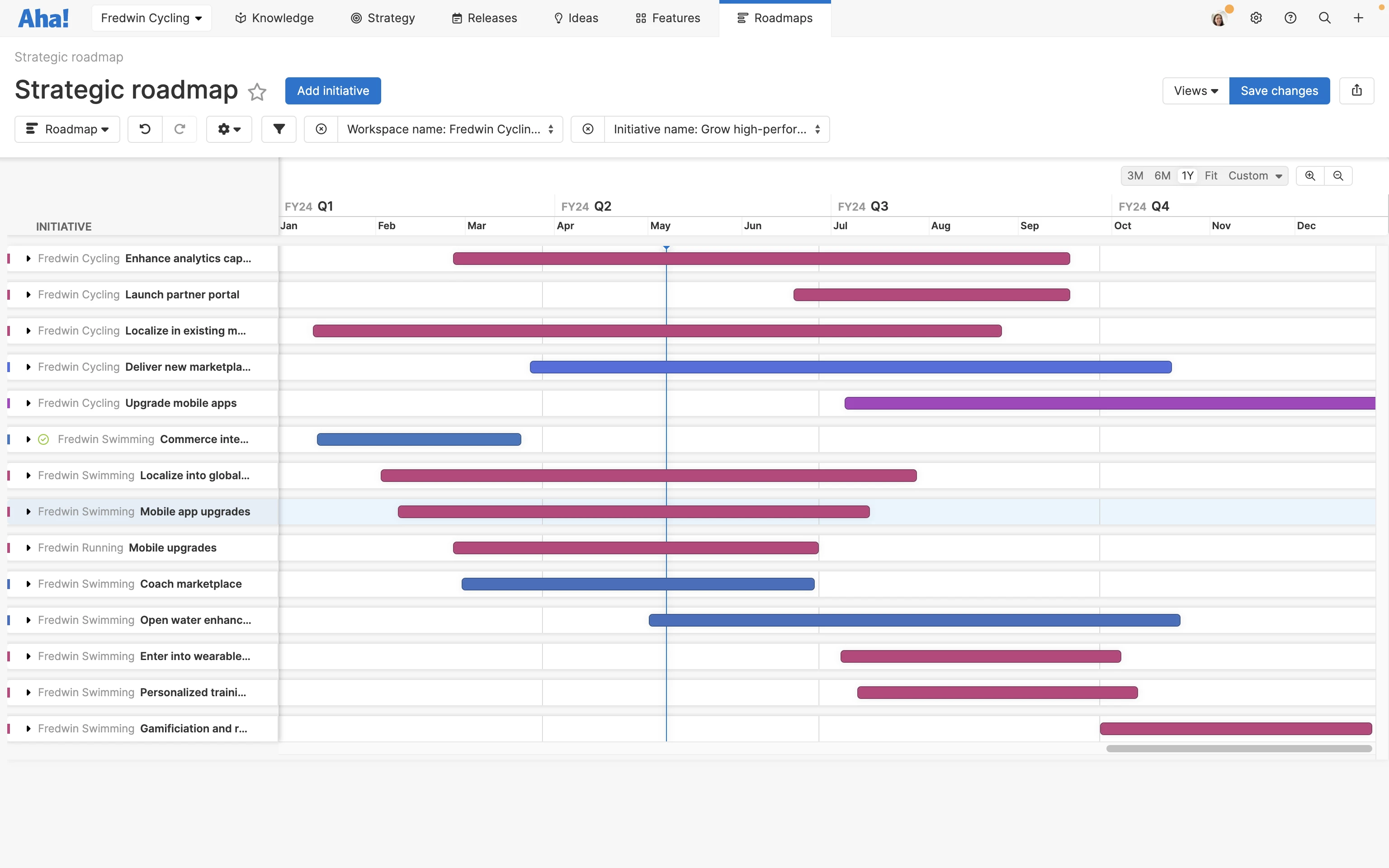
A strategic roadmap in Aha! software with color-coded bars

In the roadmap example above, we use different colors to add visual interest.

Progress indicators

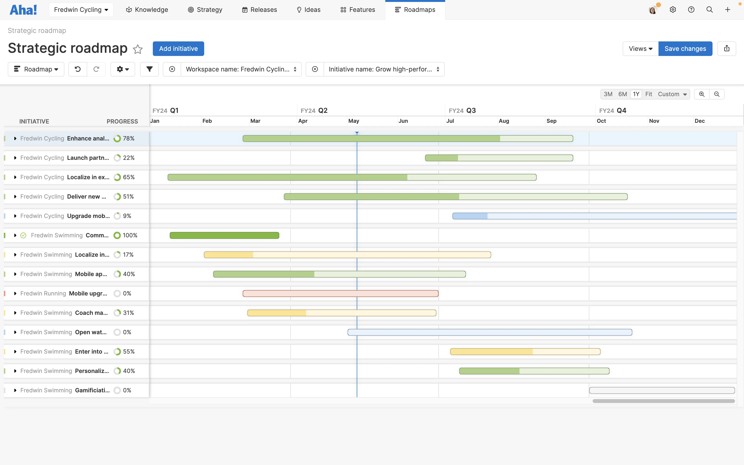
Progress data is a core component of roadmaps. You can visualize this in different ways — percentages and progress bars are the most common options.

A strategic roadmap in Aha! software with shaded bars displaying progress

In the roadmap example above, you can see which initiatives are in progress and how much work has been completed by the amount of shading on each bar.

Extra attributes

The elements above cover the essentials of a visually compelling roadmap. But there are lots of other components you can include to visualize key data:

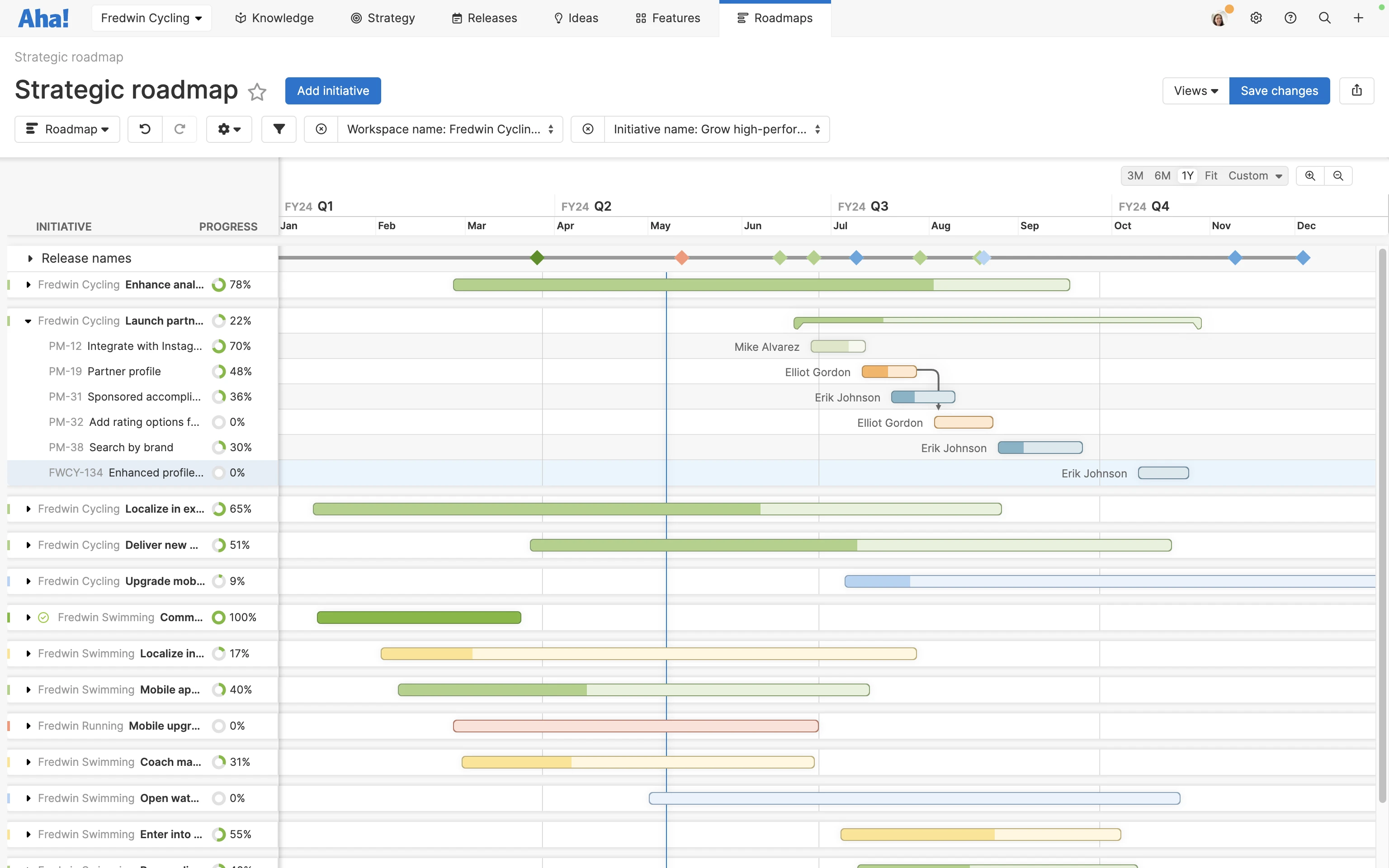
  • Milestones: Milestones typically appear as diamond-shaped markers on your roadmap and designate important dates or events.

  • Dependencies: Dependency lines link items on your roadmap that depend on each other. As you make progress, these lines help to show potential roadblocks and delivery issues if one piece of work holds up another.

  • Assignees, tags, and icons: At a basic level, roadmap items typically show the name of what they represent (e.g., feature titles). But you can always include more information — add the names of who owns each roadmap item, tags for quick visual reference, and icons for various teams or types of work.

A strategic roadmap in Aha! software with shaded progress bars showing status and dependency lines

In the roadmap example above, you can dependencies represented with connecting arrows.

If you use a dynamic tool such as Aha! Roadmaps, you can save a lot of time creating beautiful roadmap visualizations — all while incorporating your live product data. Toggle, sort, and arrange every detail, then save as many versions as you need. You can even calculate progress automatically. We really think you will love it. Try it yourself, free for 30 days.

Related:

Top

Get started with a product roadmap template

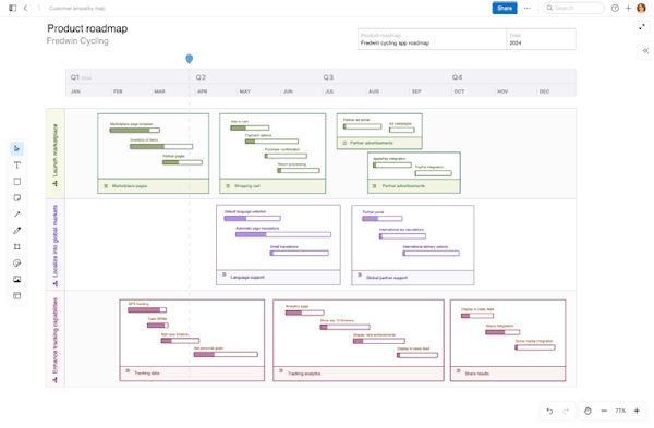
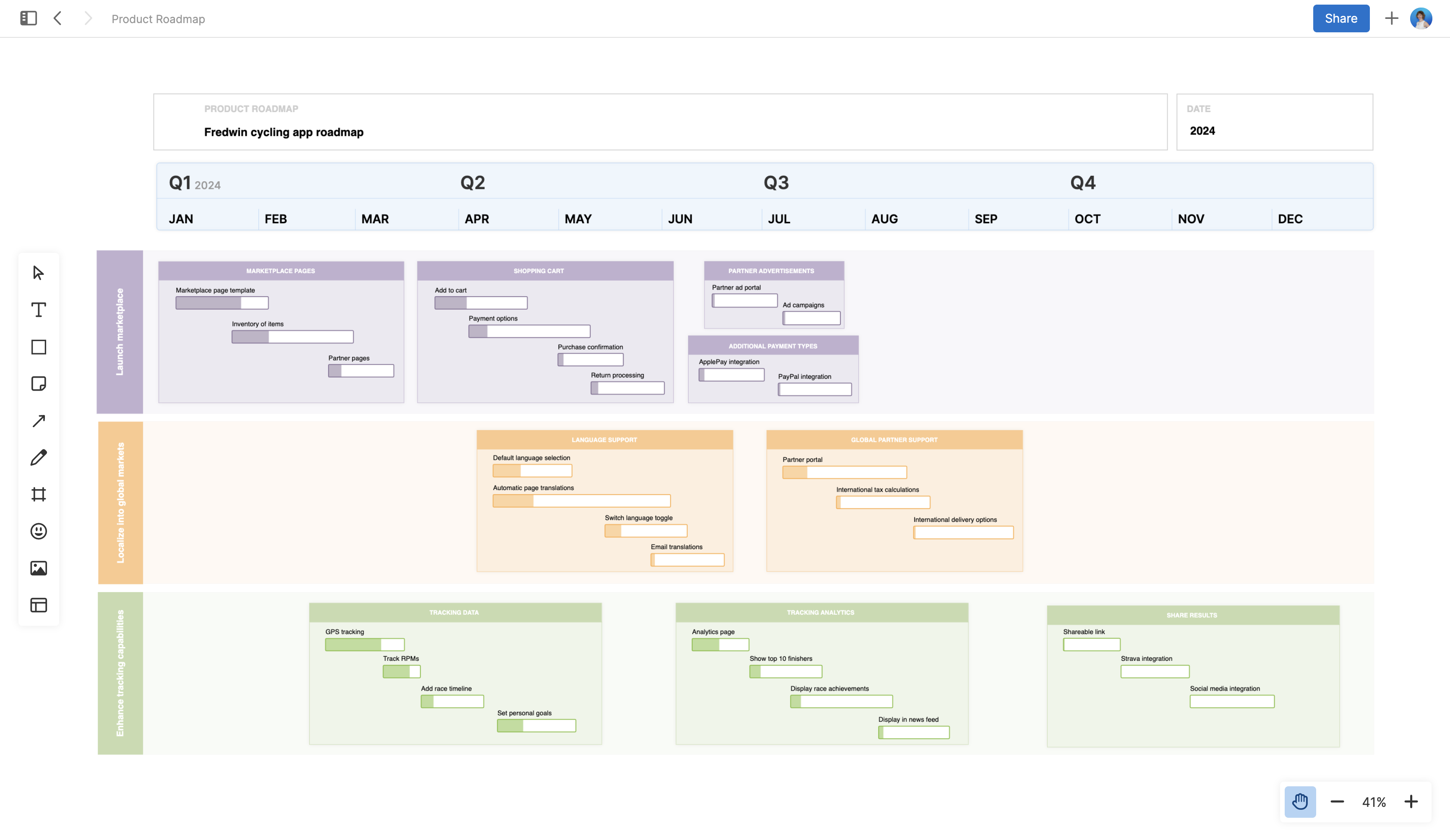
Not quite ready to dive into sophisticated roadmapping software? No worries — you can also accomplish a simple, yet effective roadmap visualization on a whiteboard. It is easy to add progress bars, timelines, and swimlanes. Then, bulk edit colors to indicate information like status or initiative. A whiteboard format also makes it easy to collaborate live on your visual roadmap with the whole team. Get started with this product roadmap whiteboard template in Aha! software.

Start with a product roadmap on a whiteboard — try the free template.

Product roadmap	 large