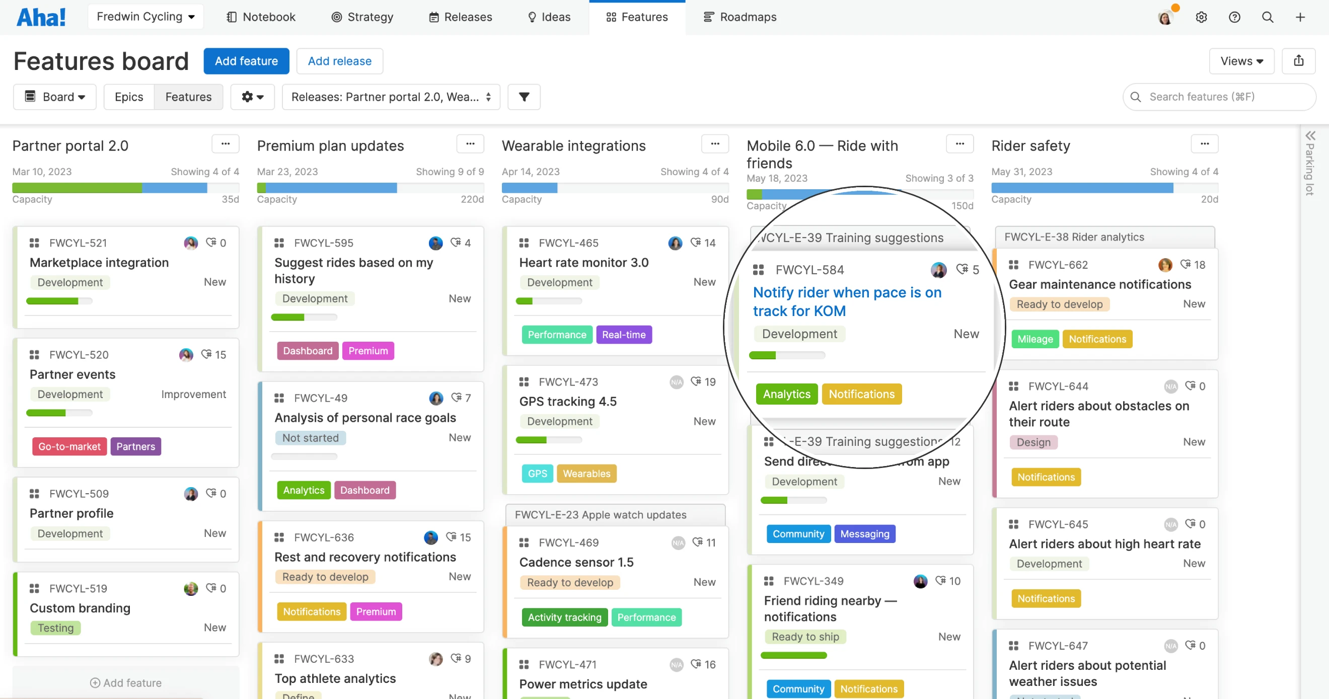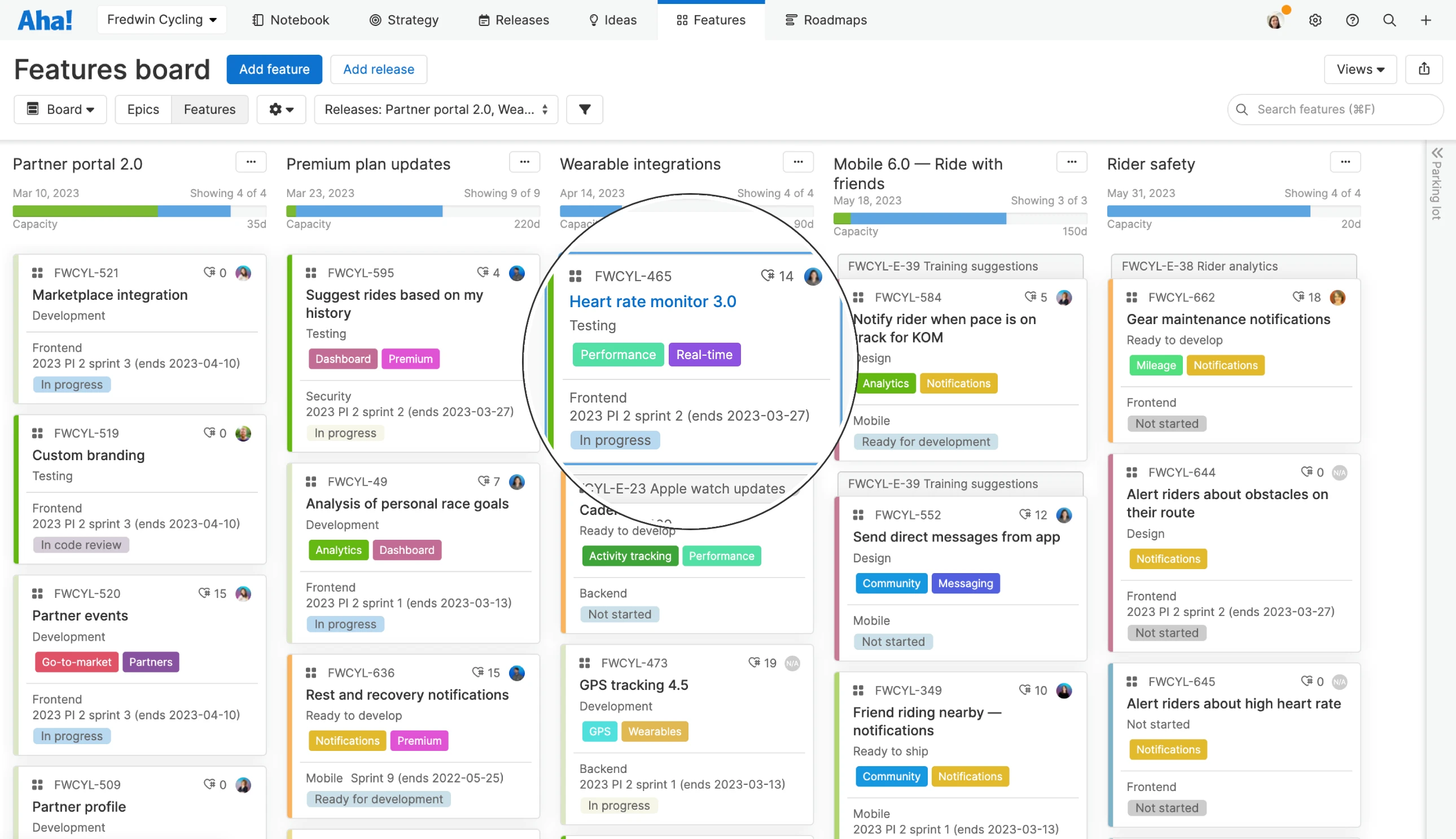
Cards are now easier to scan across Aha! software.
A Fresh New Look for Feature Cards Is Coming Soon
Cards in Aha! software are an important way to visualize your work. They are like a front door into the details — giving you a high-level summary of what you are working on and its status. You may not realize it, but close to half of all views in Aha! rely on cards. This is why it is so important that cards are readable and accessible for everyone. So we have been working on a fresh new design for cards that will help you quickly find and absorb important details about your work.
Today we are excited to give you an early look at what is coming — larger font size, better color contrast, and other readability improvements.
The new design goes live on March 29. For today's early look, we are focusing on feature cards — the most used record type in our software.
When you land on the features board, the first thing you will notice is that the name of each feature stands out more clearly. The font size is larger and the text color is now black instead of blue. This makes it easier to scan the board and quickly find what you need. When a card is selected, the border changes to blue — so you can better navigate the board with a mouse, a keyboard, or voice controls.
Currently, the background color for cards on the board reflects the feature's status. This helps you discern where work is in your workflow. As part of the updated design, background colors are lighter to improve contrast and readability. Prefer even greater contrast? A new option in the card customization modal lets you highlight status in the sidebar only — changing the background color to white.
Speaking of card customizations, you can already customize cards to include the most relevant details about each work item — such as assignee, status, feature type, and tags. But if you have a lot of information on each card it can be hard to quickly scan and absorb. When the new design goes live, you will be able to drag a divider line anywhere onto your card layout to better organize key data.
Enjoy the updated look and customization options in your account next week. You will see the improvements across all types of cards and views — from the workflow board to calendar views, Aha! Develop boards, and more. You can customize your personal view of cards on the features board or workflow board. Or, if you are a workspace owner, you can set default card layouts in workspace settings.
Let's take a closer look at what you will see:
The beauty is in the details
Feature board full of cards? Ours too. It is a good thing to be ambitious — but you also need to absorb all of the information quickly. You want to find the features you need, discern their status, and understand who is working on what. In the example below, we are highlighting feature status in the sidebar of each card to improve contrast.
We have also added a divider line to better organize the data. Information about the work itself — like product value score, assignee, and tags — is organized above the line. Details about implementation happening in Aha! Develop — like engineering team, sprint, and status — are below the line.
Explore the new designs and customization options starting March 29.
These improvements are just another way we are working to make Aha! software more delightful to use. We hope the focus on readability and accessibility makes it easier for you to build lovable products and be happy doing it. And look out for even more enhancements to your everyday experience coming soon.
Sign up for a free trial of Aha! Roadmaps
Aha! Roadmaps is the best way to set strategy, prioritize features, and share visual plans. It includes Aha! Ideas Essentials for crowdsourcing feedback. If you are interested in an integrated product development approach, use Aha! Roadmaps and Aha! Develop together. Sign up for a free 30-day trial or join a live demo to see why more than 700,000 product builders trust our software to build lovable products and be happy doing it.


