Just Launched! — A Visual, Interactive Feature Dependency Map
We were all trained to talk about benefits, right? Never technology. It is all about carefully explaining the customer value. We usually agree — but not this time. Sometimes the technology is as interesting as it is useful. So today we are going rogue. We want to explain not just what we launched and why you should care but also how we built it.
Many of you have asked for a compelling way to visualize relationships between records (e.g. features) in Aha! — it was a popular feature request in our Aha! ideas portal. So we approached our engineering team with a challenge to help you visualize dependencies in a beautiful and interactive way. And we were wowed to see what they delivered.
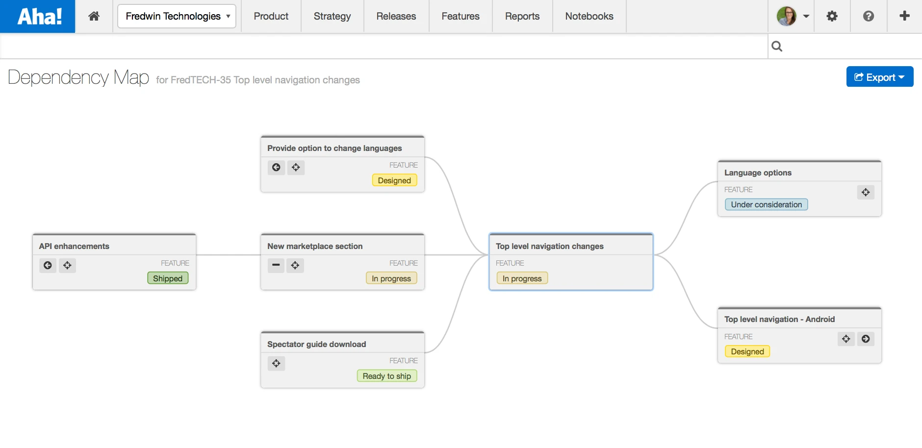
Today’s launch brings you a breakthrough visualization. The interactive dependency map allows you to see how key work is related. With one click, you can now display dependencies in an interactive visual and share it with your team.
There are clear benefits to better understanding how your data is related. It’s great when working on the details, but this new capability is not just about feature dependencies. You can identify important blockers and constraints that are impacting your strategic initiatives, for example. And you can even track that a special platform release needs to ship before development can start on another product’s feature. With this in mind, you might wonder what it looks like and how our engineering team made it happen.
I am excited to introduce you to our latest innovation. The new interactive dependency map is a unique visualization that takes advantage of the D3 library to deliver a stunning user experience.
Here’s how it works:
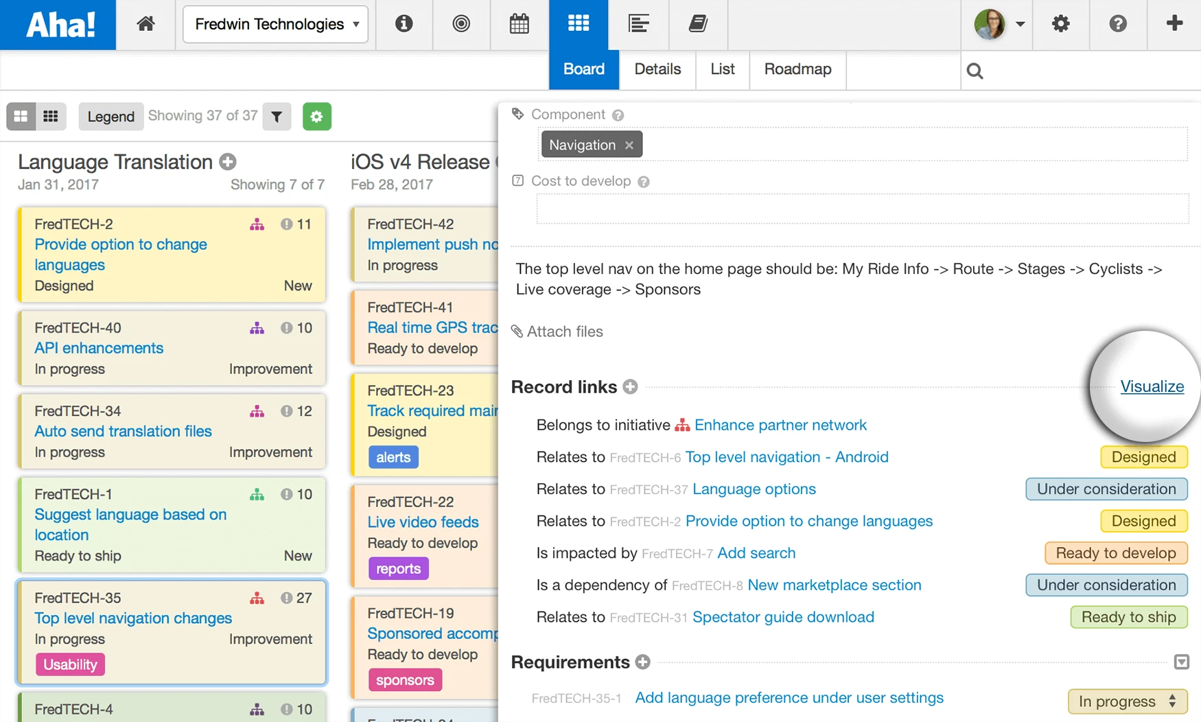
Visualize dependencies everywhere You could already connect just about anything in Aha! by selecting “Link to another record” in the “Actions” menu. Now, in addition to seeing all connected records, you can access the interactive dependency map by selecting the “Visualize” link.
Any initiative, release, release phase, milestone, feature, or idea can be linked in Aha!
Dig into the details When you select the “Visualize” link in any record, the map will center on that record. As you expand to show more dependencies, the visualization automatically resizes to give you a complete look at how things are related.
Here is how we made it happen — we used SVG to draw the curved lines and overall display. But we still needed HTML in order to show relevant information about records consistent with the Aha! use interface. We came up with an innovative solution using d3.js. This solution makes it possible to mix both HTML and SVG in the same layout, ensuring that the visualization works across all browsers.
Need more details? Select any record from the interactive dependency map to open the drawer view.
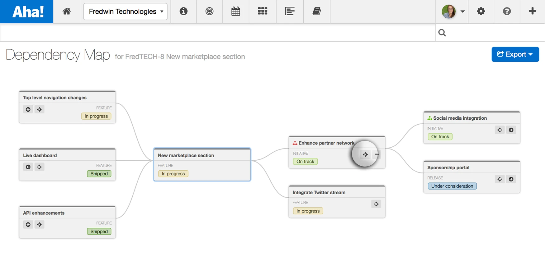
See the big picture The interactive dependency map brings a new layer of visibility into your product plans. For the first time, you have the ability to see both dependencies upstream (to see what impacts your record) and downstream (to see everything impacted by your record).
However, getting the map to branch out in both directions was not easy. This required a bit more work beyond typical d3.js examples, but it ultimately came out nicely.
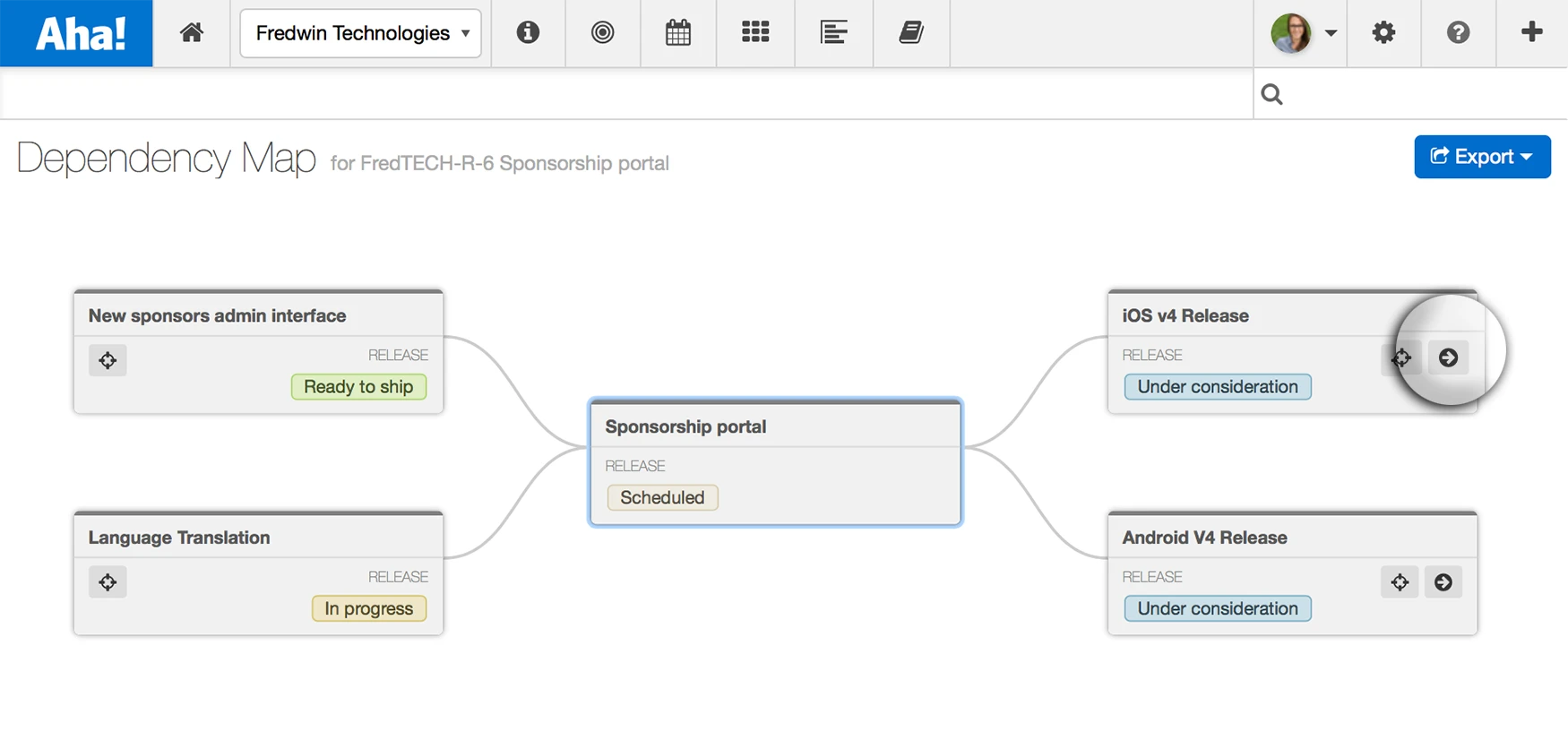
Select the arrow icon to expand the map and show the next level of dependencies on that record.
Focus on important items As you expand to add more records, you decide where to focus your attention. Select the target icon (circled in the image below) to recenter the map and visualize all dependencies associated with that record. As you adjust the map, you might notice the smooth transitions and rescaling of the page. It’s not magic but pretty close to it. Our engineering team leveraged the d3.js enter/update/exit cycle to ensure that your presentations always maintain smooth transitions.
Identify blockers, then expand to see what other work will be affected by not delivering critical initiatives.
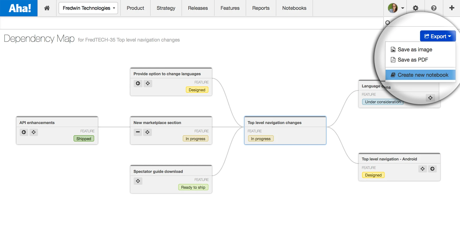
Share with your team What good would a beautiful visualization be if you could not share it? Export your interactive dependency map as a PNG or a PDF, or add it to an Aha! Notebook. It is now easier than ever to look ahead and give the team a full understanding of how their work impacts future plans.
Share plans around the work that needs to be done before shipping key features and releases.
As you know, innovative solutions to complex problems do not appear overnight. It takes hard work and the ability to see things from a different view.
Our product and engineering teams put a lot of hard work into this new functionality. And I am thrilled to show off the ways that it can help you make better product decisions. But I’m even more excited to highlight the innovation from the talented teams who designed and built it.
Sign up for a free Aha! trial — be happy Interactive dependency maps are available to all Aha! customers. If you are not already an Aha! customer, you may want to sign up for a free 30-day trial now to see why over 50,000 users trust Aha! to set product strategy, create visual roadmaps, and prioritize releases and features.

