Perfecting a Smooth Scrolling Experience for Large Tables
Depending on who you ask, the <table is a quintessential cornerstone of web development old and new; an outmoded curiosity from a time where CSS lacked floating elements; or somewhere in between. But even the biggest critics of the <table must admit that it is excellent at one task: laying out and automatically resizing to accommodate data of varying width and height.
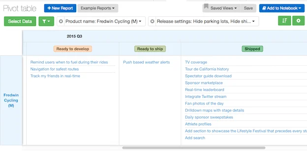
This made the <table the obvious choice for Aha! Reports, which allows users to pivot a huge range of data from Aha! in cells that may be very wide, very tall, both, or neither.
The problem we quickly encountered, though, is accommodating tables that are much larger than the screen size. Scrolling a standard <table will cause the headers to disappear on both the top and left, making it difficult to figure out exactly what data you are looking at. This problem was exacerbated by the fact that many common use cases produce pivot tables that are several thousands of pixels wide or tall, making it far too easy for users to get lost while scrolling.
We investigated a variety of existing solutions but found that multidirectional sticky-header scrolling was essentially an unsolved problem in web development. Existing plugins supported one direction of scrolling (such as sticky column headers) but not two, which was no good for our use case. Other sites that had the same problem simply resorted to not using <table elements at all – but that meant resorting to arbitrarily sized <div elements which frequently cropped data if it was too large – again, no good for a view that is intended to surface data from across Aha!
So I cracked my knuckles and got to work on a new solution. I originally experimented with just cloning the <thead and <th elements and setting their position to fixed, manually adjusting the position of each header when scrolling the other. But this lead to some unsatisfactory scrollbar behavior – the scrollbars took up the entire height and width of the table (rather than just the body which was truly being scrolled) and displayed inconsistent browser behavior – some browsers would insist on positioning the fixed header over the scrollbar regardless of which CSS attributes I set.
Frustrated by that approach, I was struck with an idea: what if we could leverage the layout flexibility of the <table to generate correctly-sized <div elements for scrolling? That line of inquiry became the basis for the unique scrolling behavior of the pivot table.
The table is initially rendered using a classic <table. However, immediately upon pageload, that <table is used to generate a series of <div elements which are actually presented for user interaction. The row and column headers are generated as a very wide (or tall) series of <divs contained by a fixed-position wrapper. Similarly, the table body itself is used to generate <divs contained by a fixed-position body wrapper. Scrolling “just works” – the headers are set to overflow: hidden and the body is set to overflow: scroll; and scrolling the body triggers an appropriate update to the scroll position of the headers. The result is a buttery-smooth scrolling experience that allows the table to be useful at any size and scroll position.
Here at Aha! we are obsessed with building perfect user experiences that are excellent down to the most minor of details. We believe that our technology should never be an obstacle to our customers’ product management success, and we back up that belief with an unwavering commitment to solving technical problems via any means necessary.
If that sounds like you, we are always hiring driven and skilled developers to work on our Rails, CoffeeScript, and React.js stack – check out our careers page.
