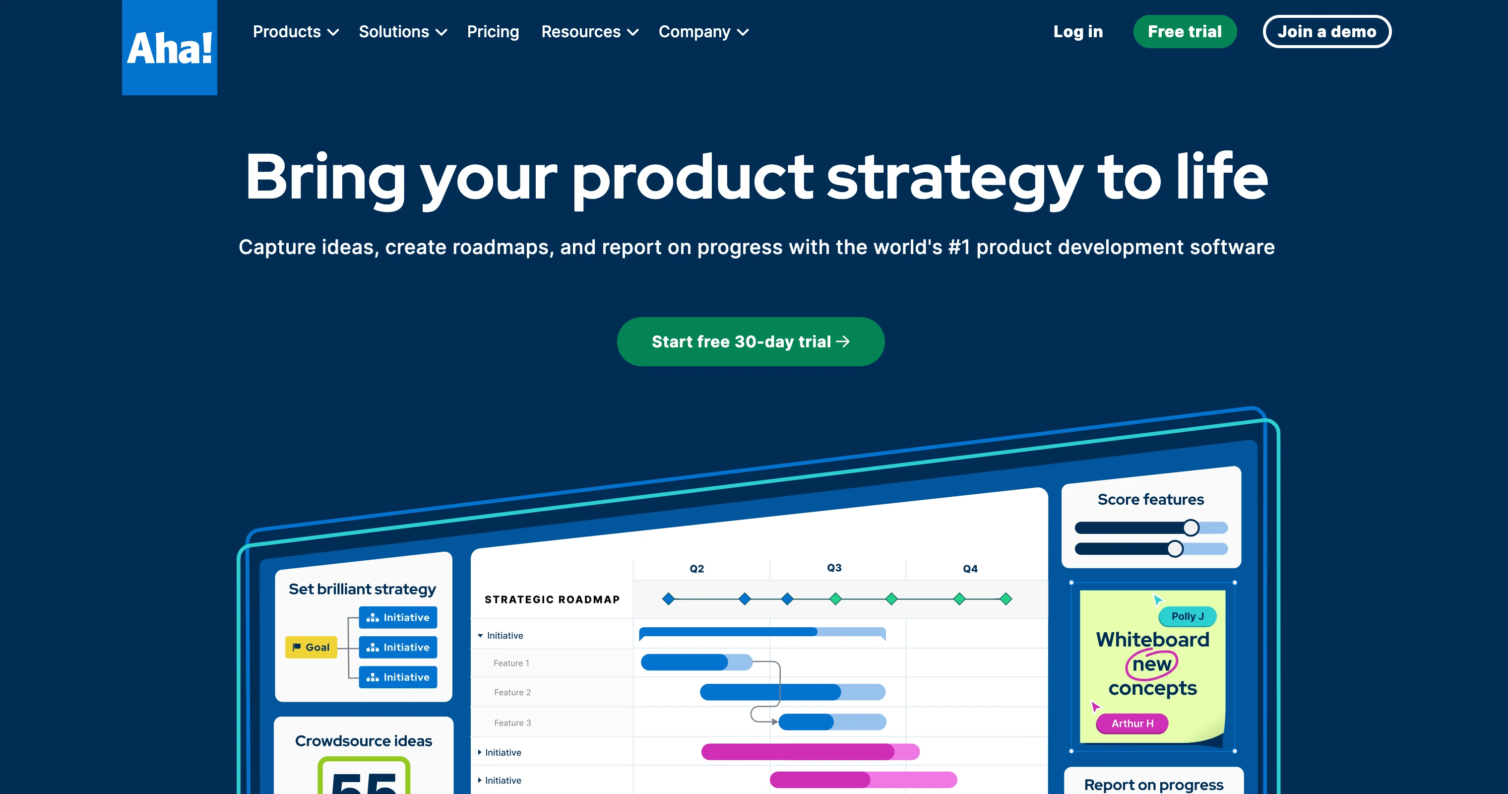
The new Aha! homepage is designed to better reflect who we are.
Introducing a fresh new look for Aha!
“What do you think?”
About a month ago, I asked folks on LinkedIn about some new designs for the Aha! homepage. (And then I asked again after our team made some updates based on the feedback.) Most of the people who engaged with the poll and added comments are not folks I know personally. I found it heartening that so many of you were willing to share your perspective and make thoughtful suggestions for how the imagery and copy could be more successful.
Branding serves a greater purpose than visual polish — it is an opportunity to highlight what makes you unique.
The hard part is representing what you are about with integrity. What you show needs to be true, and that requires self-reflection and a certain level of vulnerability — you need to consider how others would define you. This is one reason why people confuse a company’s identity with its brand. Identity is who you are. Brand is how people you care about perceive you based on their interactions.
Over the last decade, Aha! has grown from a bootstrapped startup to a well-known $100M business that serves more than 700,000 product builders worldwide. During that time, we went from one roadmapping product to a comprehensive suite of product development tools. Thousands of enterprises now depend on Aha! software to innovate and build products their customers value.
The way people perceive us has shifted and evolved with each phase of growth at Aha! — but who we are has not fundamentally changed.
Hitting our 10-year anniversary and expanding our product portfolio with the launch of Aha! Notebooks created a natural opportunity to reimagine the way we communicate what our company is all about. You see, the homepage design mockups that I posted on LinkedIn were just a sliver of a much larger brand identity project that our creative team has been fearlessly dedicated to for several months.
I am excited to share how that work manifested on the updated Aha! website, along with some of the team’s more subtle design choices that make the new look shine:
Celebrating a different type of high-growth business
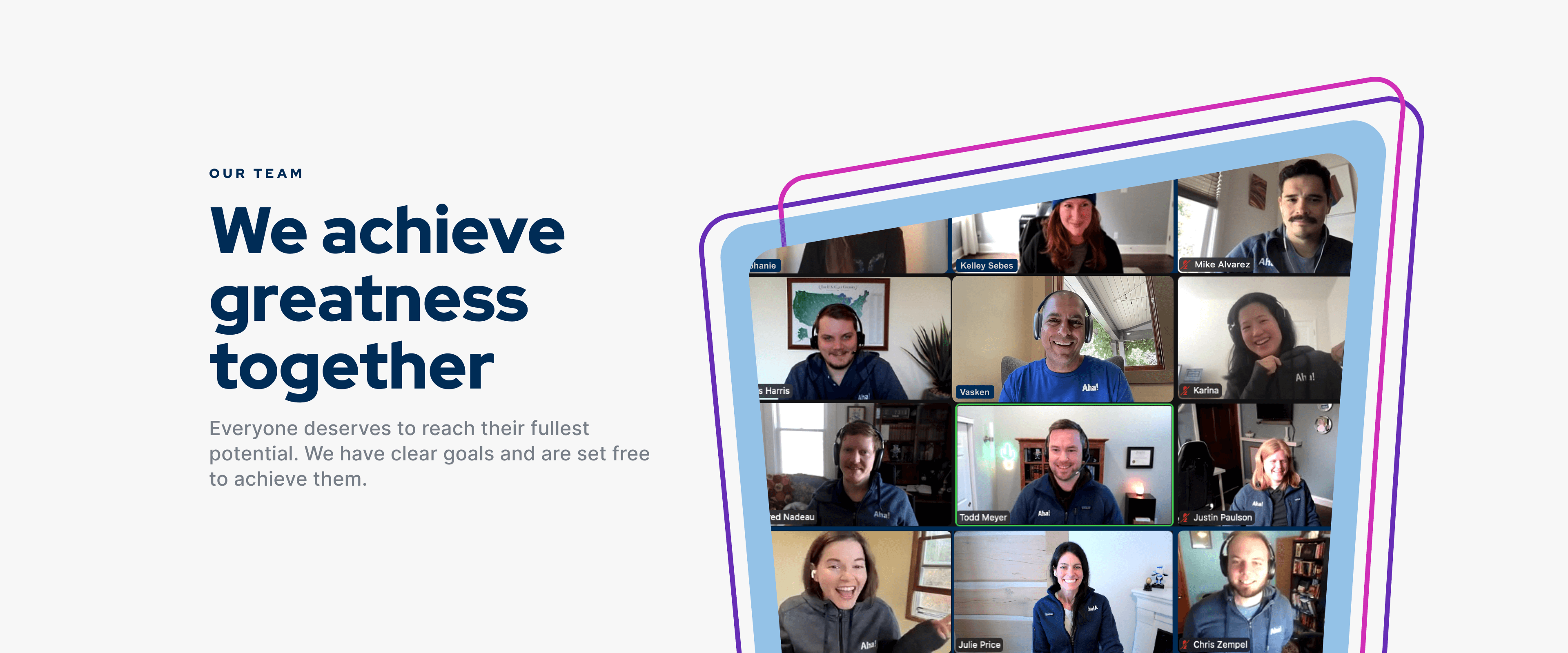
We first worked to capture the essence of Aha! in words. Our company is unusual in SaaS — we are 100% bootstrapped, remote, and profitable. (Non-VC. No salespeople.) The words we chose to describe ourselves are more than just desired attributes. They are reflective of the way we operate as a business and our amazing teammates who make Aha! so special. The final list is “bold, expert, responsive, heartfelt, and successful.” Across the website, images of our actual team (no stock photography here) bring to life how we embody those characteristics and serve our customers, colleagues, and communities.

Distilling the power of Aha! software
We know that Aha! helps product builders deliver what customers value most. With a comprehensive set of tools that support every step of the product planning lifecycle, our software can go as far as you can imagine. The team built upon the beloved Aha! blue and came up with a bold new palette of colors that conveys the power of what is possible with our software. Product tours for Aha! Roadmaps, Aha! Ideas, Aha! Notebooks, and Aha! Develop sizzle with fresh hues and dynamic lines that reflect the energy of product building.

Showcasing the guidance of our product experts
We hire exceptional people who readily share their expertise. Our team of product experts all come with deep experience in software — they can just as easily offer their experience as former product managers as they can recommendations for the best way to configure your account. But customers are not always aware of how accessible these consultative services are. So we splashed out the resources available to you, from engaging demos with our Product Success team to the wide range of tutorial and training options in Aha! Academy.

Highlighting the success of our customers
We know our customers’ success is our success too. In fact, many folks exclaim how much their teams transform after embracing the Aha! way of product development. Our team leaned into that idea, choosing a new font for the website that draws inspiration from the exclamation point in our logo. (The top of each letter in the new font shares the logo's forward-moving slashed angle.) We also brought that assertive look over to imagery that celebrates our customers, such as the Product All-Star series.

Aha! has been fortunate to realize sustainable success, and it is our mission to help others do the same.
Our goal was to more overtly show our bold, yet heartfelt approach to building people-centered products and businesses. We hope that when you visit the Aha! website, you will better understand what we are about and be inspired to build products with purpose and soul.


