Building a dynamic Canvas rendering engine using JSX
Our product team is busy adding many great new features to Aha! Whiteboards and Aha! Knowledge — including wireframes, voting, and improvements to viewing Aha! Roadmaps data within a whiteboard. We added all of this functionality in just the last few months, and we are busy building even more features that will deliver product value to our users.
As the engineering lead for these products, I saw all of the above features (and others) on our product roadmap and had a few thoughts:
- How can we easily build features that rely on dynamic content and real-time user collaboration?
- How can we do that on Canvas? Rendering dynamic content on Canvas is complicated — or at least, it's much more difficult than using HTML and React, which is how we have built most interactive features at Aha!
The challenge
Anyone who has used Canvas in the past understands the challenge. You cannot simply render content to the screen — you must manually draw content using functions such as lineTo, fillRect, fillText, and so on. Consider the really simple example of rendering "Hello, world!" with basic styling and a quick layout. Let's try and reproduce this HTML in Canvas:
<span style="border: solid 1px black; padding: 5px; font: 16px Times;">
  Hello, world!
</span>
The code above will produce this:

But let's see what we would need to generate this in Canvas:
// Rendering context
const ctx: CanvasRenderingContext2D = canvas.getContext('2d');
const padding = 5;

// Measure the text
ctx.font = '16px Times';
ctx.textBaseline = 'top';
const textMetrics = ctx.measureText('Hello, world!');

// Calculate the box size
const contentWidth = textMetrics.width + padding * 2;
const contentHeight =
  textMetrics.fontBoundingBoxDescent +
  textMetrics.fontBoundingBoxAscent +
  padding * 2;

// Draw the border
ctx.fillStyle = 'black';
ctx.strokeRect(0, 0, contentWidth, contentHeight);

// Render the text
ctx.fillText(
  'Hello, world!',
  padding,
  padding + textMetrics.fontBoundingBoxAscent
);
Almost 20 lines of code just to render the most basic of content.
Dynamic content
This becomes even more complex when you start adding dynamic content. For example, one of the first features in our Aha! Whiteboards roadmap was to add emoji reactions to our sticky note shape. This is a simple way to gather feedback from everyone viewing the whiteboard. The feature seems simple enough. In React/HTML, you might have something that looks like this:
<button className='emoji-button' onClick={clickHandler}>
  👍 1
</button>
And here is what the user would see:

In Canvas, this becomes much more difficult. We have to render the button, add the padding and border radius, and then render the emoji and reaction number.
But it doesn't stop there: What if 10 people react with a thumbs-up? Or 100? Now, that button must be wider to adapt to the content inside of it. In HTML, you don't even have to think about this. It just happens. You would just write your code like this:
<button className='emoji-button' onClick={clickHandler}>
  👍 {counter}
</button>
Chances are that's how your component was written in the first place. You didn't even think about how to resize the button element — the browser's rendering engine just did that for you. Emoji reactions was just the first feature I saw in our roadmap. And there were many others. But the big, daunting one was wireframes.
Not only did we need a way to render a button that was entirely in our control, but we also needed to allow users to create their own buttons and add their own content to it. And a button was one of the simpler components we needed.
The naive solution
The very naive solution would be to write each button and wireframe shape separately. You could perhaps create a renderButton function as a helper to render a button to the Canvas. Generalize the above code into a function, and you come up with something like this:
// Rendering context
const ctx: CanvasRenderingContext2D = canvas.getContext('2d');

function renderButton(text: string, padding = 5) {
  ctx.save();

  // Calculate the box size
  const textMetrics = ctx.measureText(text);
  const contentWidth = textMetrics.width + padding * 2;
  const contentHeight =
    textMetrics.fontBoundingBoxDescent +
    textMetrics.fontBoundingBoxAscent +
    padding * 2;

  // Draw the button background
  ctx.beginPath();
  ctx.roundRect(0, 0, contentWidth, contentHeight, 4);
  ctx.fill();

  // Render the text
  ctx.fillText(text, padding, padding);

  ctx.restore();
}
But this solution is limited. It only solves a specific problem and doesn't help fill in the functionality gap that HTML addresses out of the box. Imagine how this would scale as you add more complex shapes like these:
Navigation menu:

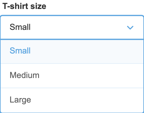
Dropdown picker:

So the complexity of rendering all of these wireframes grows quickly, even with relatively simple shapes. How do you calculate the width and height of each navigation item? How do you render the borders, backgrounds, and dividers between each item?
Buttons
Let's take a deeper look at a very simple shape we have in our Wireframes: the button. As I demonstrated above, implementing a basic button renderer would not be difficult in and of itself. But there is already a bit of added complexity here. Our button needed to support multiple styles:
| Style | Example |
|---|---|
| Basic |  |
| Rounded |  |
| Outline |  |
| Rounded outline |  |
| Link |  |
Each of these variations adds a bit more code and complexity to our renderButton function. It would definitely be possible to support all of these designs with a single function, but would it be elegant? Reusable? Dynamic?
Did you notice the icons? Well, users can choose to place the icon on the right side instead. And they can change the color of the button and the text, too. By themselves, each of these are minor things to add. But eventually, that function would become overloaded with all the variations, customizations, and edge cases that need to be handled.
JSX
In order for our team to be able to easily implement all of these features, we needed a readable, elegant, and powerful way to render dynamic content to Canvas in a familiar way. I thought to myself, wouldn't it be great if we could just render content to Canvas the same way we do with React?
And then I had my Aha! moment. WE COULD! To do this, we would use one of the really powerful and innovative features that React introduced to the world — something called JSX. It's really just syntactic sugar to write HTML syntax into declarative and well-structured element objects. For those of you who are unfamiliar with JSX, what it does for you under the hood is convert code like this:
<button className='emoji-button' onClick={clickHandler}>
  👍 {counter}
</button>
Into something like this:
_jsx(
  'button',
  { className: 'emoji-button', onClick: clickHandler },
  '👍 ',
  counter
);
JSX, in my opinion, was the biggest innovation that came out of React given that you could write HTML directly in your JavaScript. I had used other frameworks such as MooTools in the past. You could use them to dynamically construct HTML in JavaScript, but with a very verbose and tedious syntax. It looked very similar to the converted code above. And it worked, but it was not satisfying or pleasant.
The beauty of JSX is that you can override how elements are converted to JavaScript code using something called a pragma. A pragma, or directive, is something that tells the JSX compiler how to process the code. In your JSX/TSX code, you can add a pragma to the top of your file like this:
/** @jsx CanvaSX */
import { CanvaSX } from 'canvasx';
Now, instead of converting your JSX to React code, the above code would be converted to something called CanvaSX code (more on this later):
CanvaSX(
  'button',
  { className: 'emoji-button', onClick: clickHandler },
  '👍 ',
  counter
);
The solution
My goal was simple and clear: I wanted to be able to write JSX code that could render a simple navigation/tab menu. The system should generate the layout and render that content for me dynamically, and I shouldn't have to think about the complexities of measuring text and padding and layouts. It would need to handle very common layout patterns such as margin, padding, (rounded) borders, and so on.
The really powerful feature would be to have all the layout complexity completely hidden from the developer. When rendering the navigation items, the width of each item would need to be based on the text and/or icon inside it, and then the borders and background should be rendered based on the width of that content. We would then need to render dividers between each item.
Introducing CanvaSX
I spent some time prototyping a rough implementation of a rendering engine that I've come to call CanvaSX (Canvas+JSX). The early versions were quite rough, but the benefits were obvious. I could write simple shapes like a button or navigation menu using very familiar syntax, and I didn't even have to think about calculating coordinates or layouts.
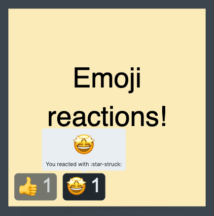
Eventually, I added support for basic interaction properties (such as onClick and tooltip handlers) and some very rudimentary flexbox-like components, too. Now, we could have something like a real button completely rendered in Canvas. The end result made the emoji button as simple as this code:
<Rect
  fill={backgroundColor}
  borderRadius={2}
  padding={2}
  onClick={emojiClickHandler}
  tooltip={emojiTooltipContent}
>
  <FlexRow gap={2} verticalAlignment='center'>
    <Emoji shortCode={shortCode} />
    <Text color={textColor}>{votes}</Text>
  </FlexRow>
</Rect>
Which made sure we could offer reactions like these:

The wireframe button is very similar, but it simply passes along user input to the properties. For example, to support rounded vs. square buttons, we just need to write something like this:
<Rect fill={backgroundColor} borderRadius={round ? 32 : 4}>
  <Text color={textColor}>{text}</Text>
</Rect>
This code is very easy to read for anyone familiar with React, and CanvaSX addresses all of the layout complexities.
How does it work?
The magic behind CanvaSX is that every component can measure itself. With this information, CanvaSX can generate the layouts automatically. This is what the Text component's measuring function might look like:
Text.calculateDimensions = (props, ctx: CanvasRenderingContext2D) => {
  ctx.save();

  if (props.font) {
    ctx.font = props.font;
  }

  const textMetrics = ctx.measureText(props.children);

  ctx.restore();

  return {
    width: textMetrics.width,
    height: textMetrics.fontBoundingBoxAscent,
  };
};
A parting note
Building CanvaSX is one of the highlights of my career. I have had the opportunity to work on many features in my more than five years of working at Aha! These include capacity planning for teams, redesigned drawers, Aha! Develop, and our custom card layout editor. I've recently worked on many improvements to Aha! Whiteboards, which is where CanvaSX came in. It has proven itself to be extremely powerful and flexible — and it is now used as the foundation for emoji reactions, wireframes, updated record cards, and our brand-new voting tool!
I work with a team of extremely talented engineers at Aha! We collaborate to solve hard problems and deliver value to our users. If this sounds like something you would enjoy doing, you should check out our open positions.
